About one in four people in the UK has a disability. Many of them will never tell you when your website gets in their way. They simply leave.
But accessibility is not only about disability. Think of a parent reading with a baby in one arm, someone squinting at a phone in bright sunshine, someone on a slow connection on a bus, or someone reading in their second language. A website that works well for a visitor with a visual impairment or with dyslexia usually works better for all of them too.
The things that help are mostly simple.
- Clear headings that describe what follows
- Links that say where they go, not “click here”
- A description for every picture that carries meaning
- Text that can be made larger without the page falling apart
- Forms that can be filled in with a keyboard alone
The same things help search engines understand your pages, so accessible websites tend to be easier to find as well.
Here is a test you can do today. Open your website, put your mouse to one side, and try to reach your contact form and send it using only the Tab and Enter keys. If you get stuck, so do some of your visitors.
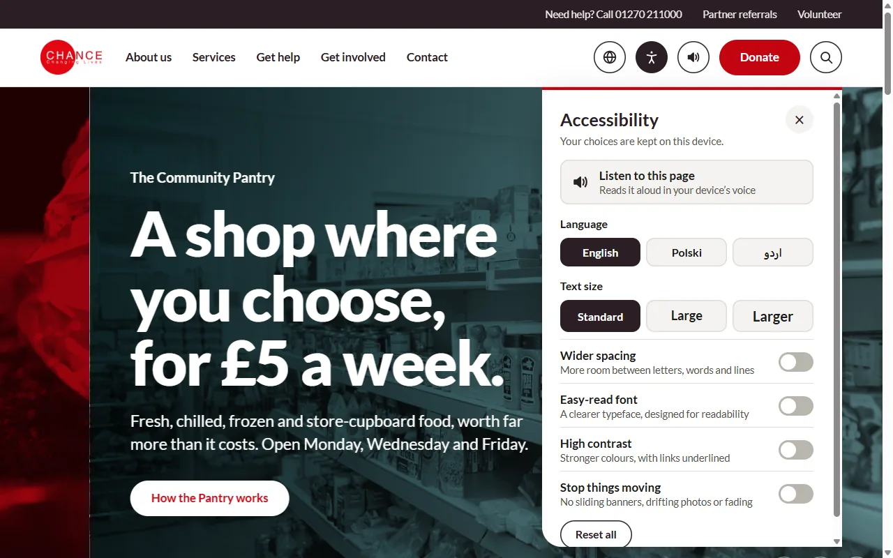
Organisations that provide services are expected to make reasonable adjustments for disabled people, and a website is part of the service. Every website we build has an accessibility button on every page, with larger text, wider spacing, an easy-read font, high contrast, calmer pages and a button that reads the page aloud.